Pronto Brand ID -
San Diego County Transit Fare System
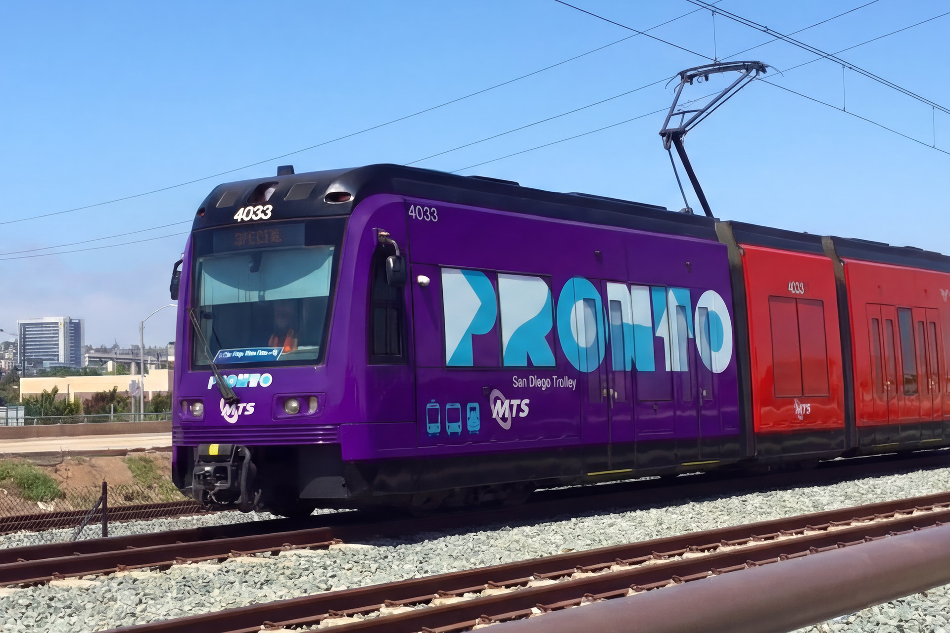
PRONTO is San Diego County’s public transit fare system, developed to simplify access to transit across multiple agencies and systems. I was engaged as the brand lead to name and design the system and establish a brand identity capable of operating at countywide scale.
Working in partnership with Civilian, I led brand discovery workshops and the naming and identity development process with Metropolitian Transit System and North County Transit District stakeholders. The identity needed to function across physical infrastructure, digital platforms, and public-facing touchpoints while remaining legible, trusted, and easy to use for a diverse public audience.


The PRONTO logo is designed as a flexible system, capable of adaptation while maintaining recognition and trust. I introduced controlled visual variations as a strength of the system rather than an exception, allowing for one-off applications tied to civic programs, cultural moments, and distinct community activations reflective of San Diego's diversity. This approach has since enabled PRONTO to reflect San Diego’s communities while remaining anchored to a consistent core identity.


I authored the initial PRONTO brand manual and delivered a complete handoff of the naming, identity system, and usage guidance in 2019, ahead of the system’s public launch in 2021. The standards were designed for long-term use across agencies and vendors, prioritizing clarity, consistency, and ease of implementation within a public-sector environment.


Selected Works


©Jordan Stark
js@productetc.com
+1 619 972 3534