San Diego Legion Rugby
Brand Identity
I was engaged to lead the naming and brand identity for San Diego’s Major League Rugby team, with the goal of creating a mark that players would be proud to wear and supporters could rally behind. The identity needed to operate within the traditions of international rugby while resonating with a local audience rediscovering professional contact sports in San Diego after the San Diego Chargers left.
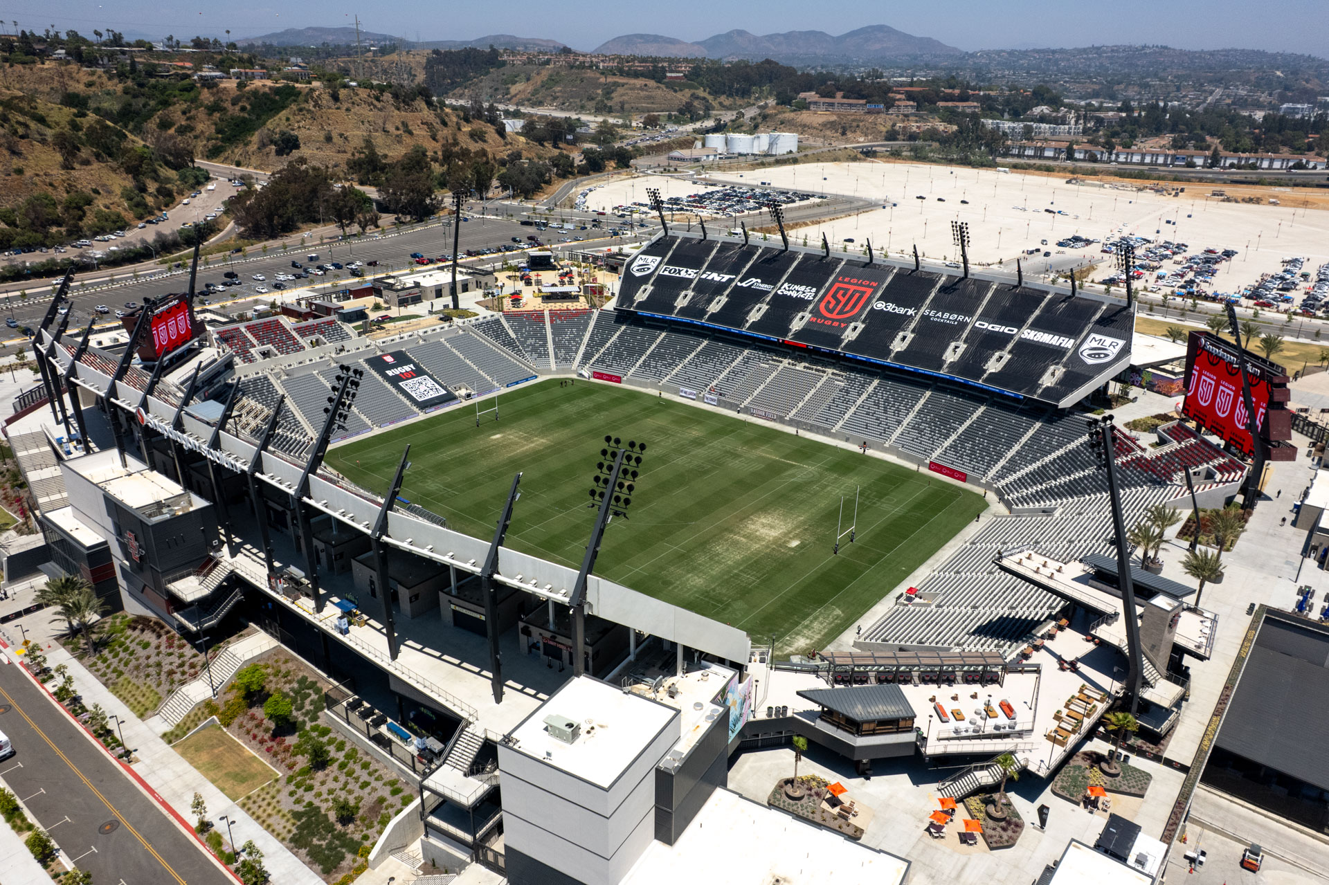
The resulting name and mark balanced multiple cultural and competitive constraints. The brand draws on the visual language of rugby crests and shields, signaling strength and legitimacy within the sport, while the modern “SD” monogram anchors the team locally without becoming overly regional or exclusionary to international players and fans.
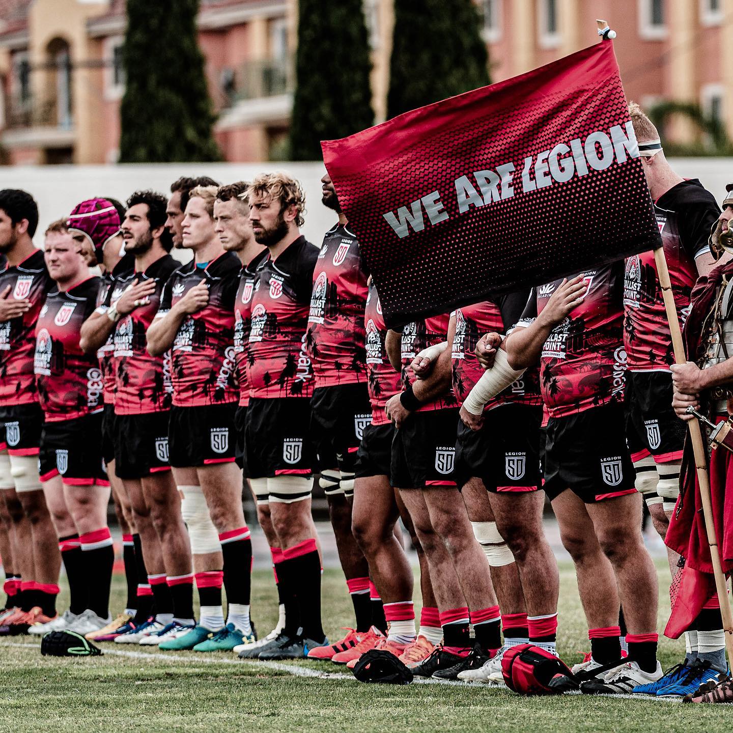
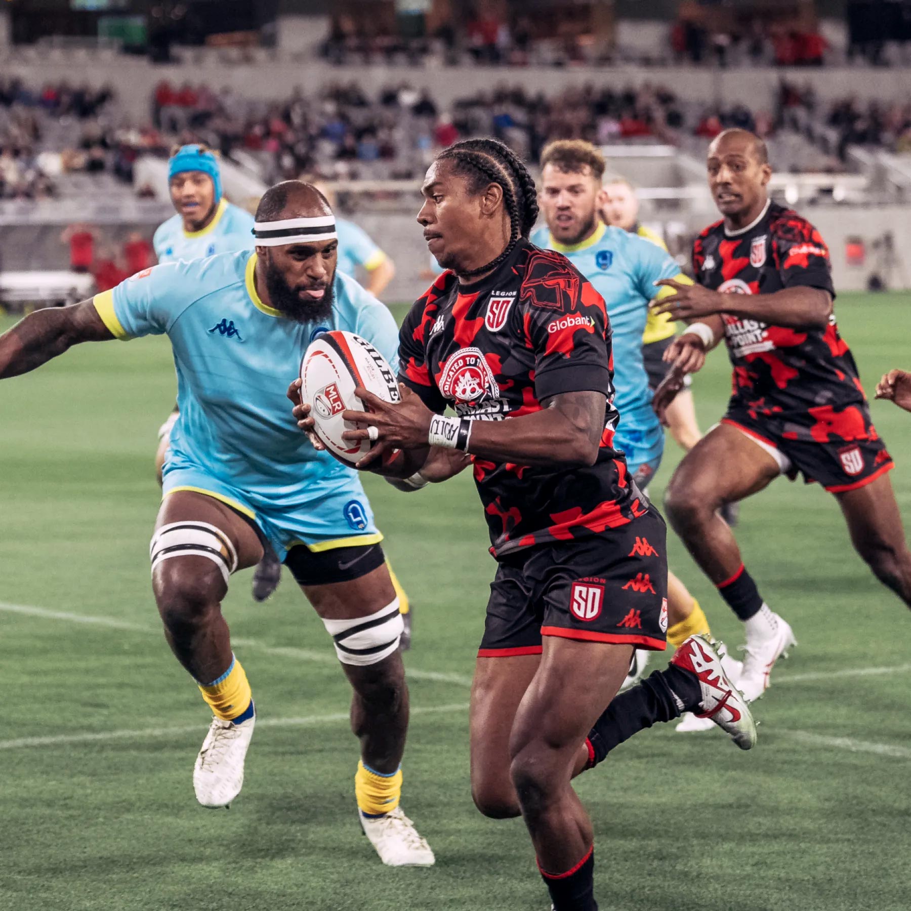
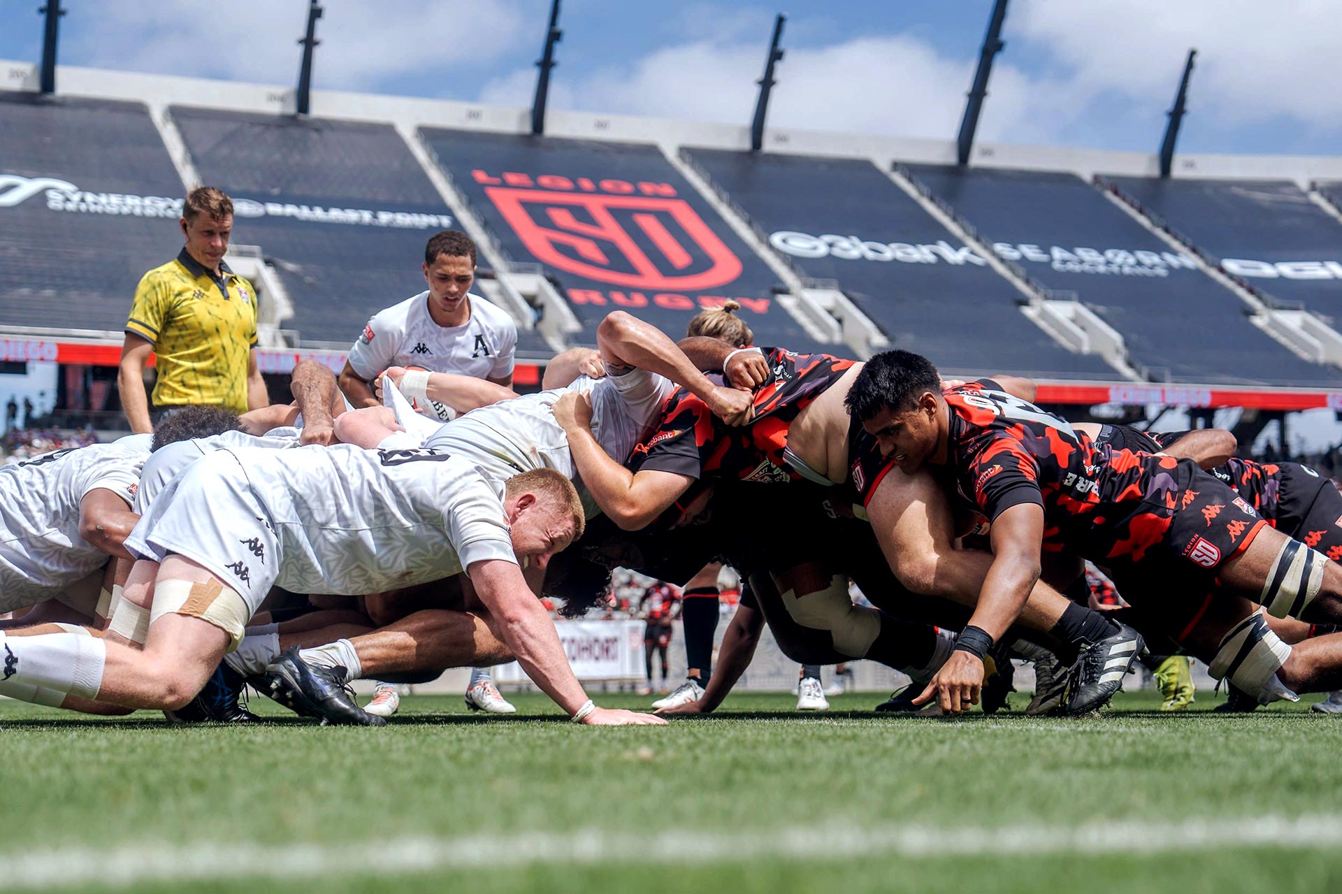
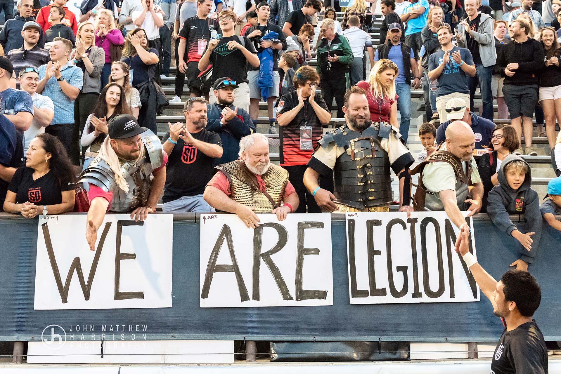
Military themes were approached with restraint, informed by both the physical nature of rugby and San Diego’s longstanding military presence, without referencing modern warfare. The final system created space for interpretation rather than prescription, allowing team culture and fan expression to develop organically. Since launch, supporters have embraced the Legion identity in unexpected ways, a response that has been welcomed and supported by team leadership.
Selected Works
©Jordan Stark
js@productetc.com
+1 619 972 3534